A landing page is one of the most important components of any digital marketing strategy. It serves as the gateway between your audience and your products or services, and how well you design it can make or break your conversions. In this guide, we’ll explore the key sections that every high-converting landing page should have and dive into each element in detail to help you maximize your results.
1. The Nav Bar: Navigating the Journey
The navigation bar (Nav Bar) is the first thing visitors see when they arrive at your landing page. It needs to be clear and concise, allowing users to easily understand their options. Since a landing page is highly focused, the Nav Bar should be minimalistic, only offering the most important options to reduce distractions.
Best Practices for Nav Bar:
- Limit the Number of Links: Provide essential navigation, such as links to the home page, products, or contact information.
- Clear Call-to-Action (CTA): Include a prominent CTA that leads users directly to the goal of the landing page.
- Responsive Design: Ensure the Nav Bar is mobile-friendly and collapses into a hamburger menu for ease of use.
By keeping the Nav Bar simple and action-oriented, you’re setting the tone for what’s to come and leading your visitors smoothly into the next sections.
2. Value Announcement Bar: Reinforcing Value Early
The Value Announcement Bar is a crucial section directly beneath the Nav Bar. This is where you clearly state the unique value proposition (UVP) of your offer. It’s your opportunity to grab attention and make sure visitors immediately understand why they should stay and explore further.
Elements of a Strong Value Announcement:
- Brief and Impactful Statement: Condense the value of your product or service into a single, powerful sentence.
- Highlight Discounts or Offers: If you’re running any promotions, this is the place to mention them.
- Urgency and Scarcity: Add urgency through phrases like “Limited Time Offer” or “Only a Few Left in Stock.”
This section is key to keeping visitors engaged right from the start and reducing bounce rates.
3. Headline and Subheadline: Capturing Attention
The headline is the most prominent text on your landing page, and it should clearly communicate what your product or service does in a compelling way. The subheadline offers a secondary opportunity to expand on your headline and provide a bit more detail.
Writing High-Converting Headlines:
- Be Specific: Instead of vague statements, use data or specifics. For example, “Increase Conversions by 35%” is more powerful than “Boost Your Sales.”
- Use Emotional Triggers: Words that evoke curiosity, excitement, or urgency tend to grab attention quickly.
- Subheadline Support: The subheadline should complement the headline by answering any immediate questions the reader might have, encouraging them to continue reading.
Your headline and subheadline should work together to pull the visitor deeper into your landing page content.
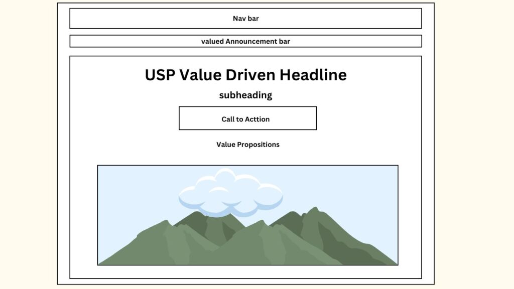
4. Call to Action (CTA): Directing the Next Step
The Call to Action (CTA) is the core driver of conversion on your landing page. It tells users what you want them to do next, whether it’s signing up for a newsletter, purchasing a product, or downloading a guide.
CTA Best Practices:
- Make It Visible: Use contrasting colors to ensure the CTA stands out from the rest of the content.
- Action-Oriented Language: Use verbs that create a sense of urgency or benefit, such as “Get Started,” “Claim Your Discount,” or “Join Now.”
- Place CTAs Strategically: Position the main CTA above the fold, but also repeat it throughout the page, particularly in high-engagement sections like after benefits or testimonials.
By optimizing your CTA, you guide the visitor toward the desired action with minimal friction.
5. Value Propositions: Why Choose Us?
In this section, you’ll outline the key value propositions of your product or service. This is where you explain what sets you apart from the competition and why your offering is the best choice for the visitor.
Crafting Compelling Value Propositions:
- Highlight Unique Features: Focus on the aspects of your product or service that can’t be easily replicated by competitors.
- Customer-Centric Benefits: Instead of talking about features, discuss the benefits that users will experience. For example, instead of saying “Our software has 100+ integrations,” say “Connect seamlessly with your favorite tools in seconds.”
- Visuals Help: Use icons or small graphics to represent each key point, making the section more visually engaging.
Value propositions are essential to building trust and convincing visitors that your product is the solution they’ve been looking for.
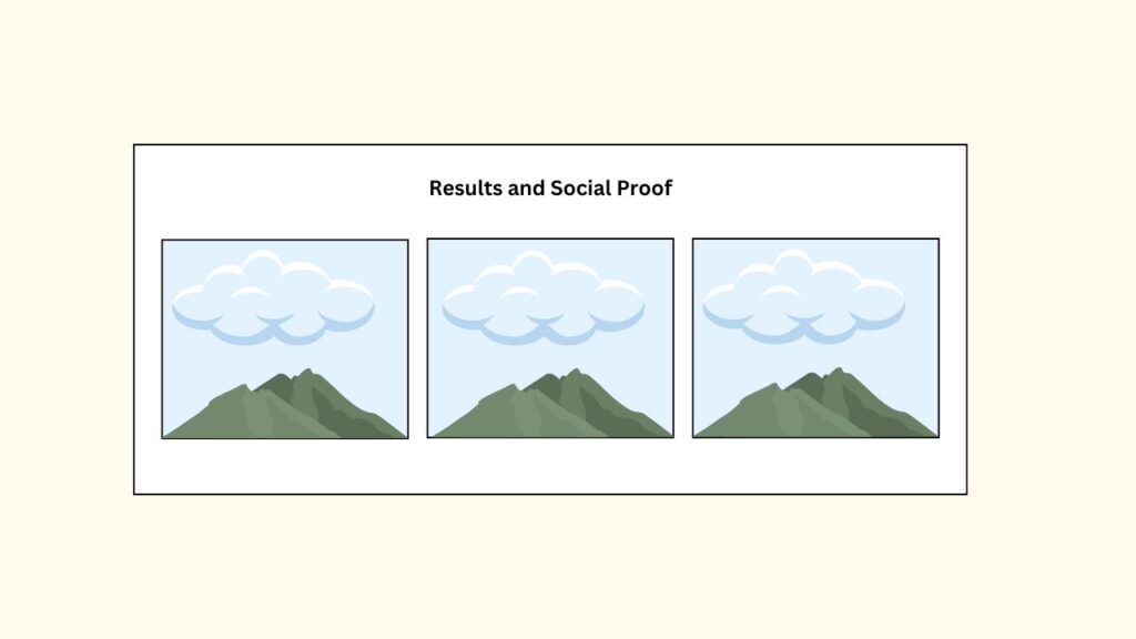
6. Results and Social Proof: Building Trust
Social proof is one of the most powerful tools you can use to increase conversion rates. This section should showcase real-world examples of people who have benefited from your product or service.
Effective Use of Social Proof:
- Testimonials: Feature quotes from satisfied customers, ideally paired with photos or videos to make them more credible.
- Case Studies: Highlight success stories and provide data-backed results.
- Media Mentions: If your product has been featured in reputable publications or shows, display these logos prominently.
People are more likely to trust your product when they see that others have already had a positive experience with it.
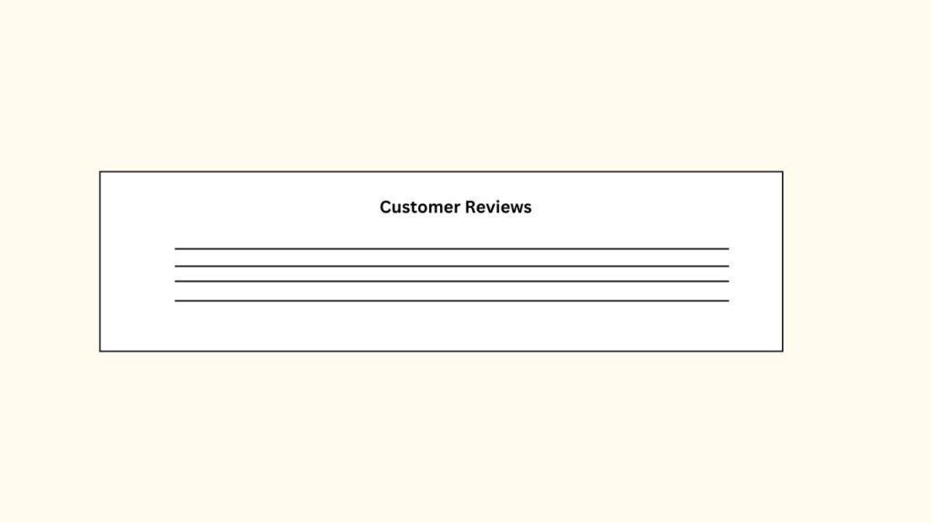
7. Customer Reviews: Boosting Credibility
Customer reviews go hand-in-hand with social proof but deserve their own section. Display authentic user reviews, focusing on the ones that provide valuable insight into the user experience.
Best Practices for Reviews:
- Real and Unfiltered: Authenticity is key. If your reviews seem too polished, they may come off as fake.
- Diverse Voices: Include reviews from different customer segments to appeal to a broader audience.
- Highlight Key Reviews: Focus on reviews that emphasize key selling points or overcome common objections.
This section further strengthens credibility, showing that real people endorse your product.
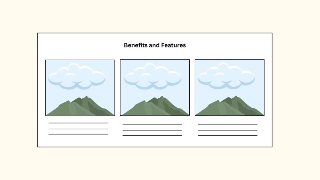
8. Benefits and Features: Explaining the Offer
In this section, go into more detail about the benefits and features of your product or service. By this point, the visitor is interested, so it’s time to give them the specifics that will lead them to take action.
How to Present Features:
- Use Bullet Points: Break down features into short, digestible bullet points. This makes it easier for users to scan the page.
- Feature vs. Benefit: While features are important, focus on the benefits they bring to the customer. For example, “Automatic Updates” (feature) translates into “Always Stay Current Without Lifting a Finger” (benefit).
- Accompany with Visuals: Use diagrams, screenshots, or videos to demonstrate how features work in real-world scenarios.
This section provides the final push to reassure visitors that your product has everything they need.
9. Buy Box: Converting Interest into Action
The buy box is a dedicated section where users can quickly make their purchase or take action. It typically contains the price, product description, images, and the CTA.
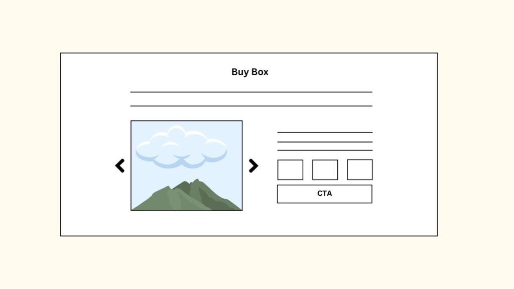
Optimizing the Buy Box:
- Clear Pricing Information: Make sure the price is easy to find and understand. If you have multiple pricing tiers, explain them clearly.
- High-Quality Images: Use professional images or videos of your product in action.
- Additional CTAs: Reinforce the primary CTA by including a CTA button here as well, such as “Buy Now” or “Get Started.”
The buy box should provide all the information a user needs to make a final decision without overwhelming them.
10. Frequently Asked Questions (FAQ): Overcoming Objections
The FAQ section is where you address common concerns and provide answers to questions that might prevent a user from converting. This helps to remove any last-minute objections.
Crafting Effective FAQs:
- Address Pain Points: Focus on the issues that are most likely to cause hesitation. For example, “What happens if I don’t like the product?” or “How long is the warranty?”
- Be Concise: Keep answers short and to the point.
- Link to More Detailed Information: For more complex answers, link to a dedicated resource or page for users to explore.
The FAQ section serves as a safety net, helping to close the deal by eliminating doubts.
11. Objections and Education: Educating the Customer
This section is designed to provide educational content that helps overcome common objections. It could include tutorials, videos, or articles that explain the product in more detail.
Content for Education:
- Product Demonstrations: Show how your product works through video walkthroughs or detailed infographics.
- Address Specific Objections: For example, if users are concerned about price, include a comparison chart showing why your product is the best value.
- Highlight Key Benefits: Use this section to reinforce the benefits in a deeper, more educational format.
By educating users, you build trust and confidence in your product.
12. Guarantee and Footer: Providing Reassurance
Lastly, offering a guarantee or strong return policy can give customers the confidence to proceed with their purchase. Your footer should also provide links to terms of service, privacy policies, and other important resources.
Key Elements in This Section:
- Money-Back Guarantee: If applicable, include a money-back guarantee or satisfaction promise to remove the risk for the customer.
- Contact Information: Make it easy for users to contact you for any inquiries.
- Trust Badges: Add secure payment icons, certificates, or any awards that reinforce credibility.
With these elements in place, the footer and guarantee sections can help users feel comfortable about completing their purchase.
Read About: The Ultimate Guide to Crafting a Effective E-commerce Homepage.
High-Converting Landing Page
By carefully crafting each of these sections, you’ll create a high-converting landing page that leads visitors down a clear, focused path toward conversion. Whether you’re building a landing page for a product launch, lead generation, or any other purpose, each of these elements plays a vital role in boosting your conversion rates and growing your business.