An Effective E-commerce Homepage is crucial to capturing attention, conveying your brand’s message, and ultimately driving sales. A well-crafted homepage is not just visually appealing but also strategically designed to guide potential customers from awareness to action. In this comprehensive guide, we’ll explore every key element of a successful e-commerce homepage to help you maximize conversions and provide an unforgettable user experience.
1. Hero Section: Captivate with a Powerful Value Proposition
The hero section is the first thing visitors see when they arrive at your store. It must create a lasting impression by communicating your value proposition concisely and persuasively. Remember, the hero section is the only section that 100% of your visitors will see, so optimizing it for first-time visitors is essential. A compelling hero section has several critical components:
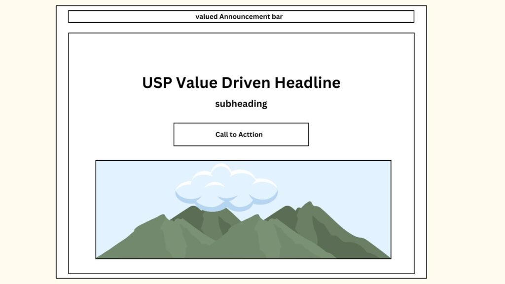
Headline and Subheadline
- USP-Driven Headline: Craft a powerful, value-driven headline that communicates the unique selling point (USP) of your product or service. The headline should be bold, clear, and instantly convey what sets you apart.
- Supporting Subheadline: Add a subheadline that provides more context or elaborates on your headline. Use this space to address potential pain points or challenges your product solves.
Call to Action Button
- Include a prominent Call to Action (CTA) button that invites visitors to take the next step. Whether it’s “Shop Now” or “Learn More,” make sure the CTA is clear, direct, and stands out visually.
- Use Contrasting Colors: Ensure the CTA button contrasts with the rest of the hero section to grab attention.
Hero Image or Video
- Visual Storytelling: Use a high-quality hero image or video that tells a story about your product. This can be a product lifestyle image, a demonstration, or an evocative visual that captures the brand’s spirit.
- Relevance: Make sure the visual content is relevant to your target audience and showcases your product in use.
The hero section is crucial for capturing attention and turning it into genuine interest. By clearly communicating what you’re selling and to whom, you help visitors decide whether they want to explore further.
2. Value Proposition: Show What Makes You Stand Out
Benefits, Features, and Value
After capturing attention with your hero section, it’s important to immediately show the value your brand offers. Use the next section to highlight the key differentiating factors of your products or services. A good value proposition section will:
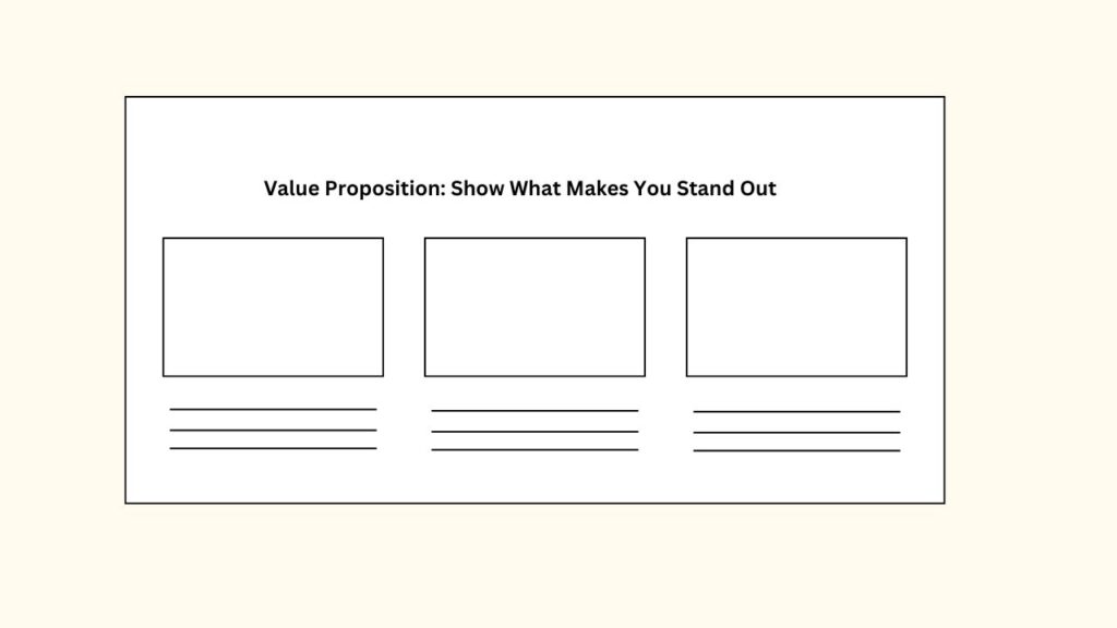
- Break Down Benefits: Identify the 3-5 key benefits of your products. These benefits should solve specific pain points or challenges that your target audience experiences.
- Use Visual Elements: Present these benefits in an easy-to-digest layout, using icons or images to make the text visually engaging. Each benefit can be accompanied by a short description to provide added context.
The purpose of this section is to help potential customers quickly grasp why your brand is the best choice. Focus on value-driven messaging that appeals to both logic and emotions.
3. Best Sellers: Guide Customers with Social Proof
Best Selling Products
Showcasing your best-selling products is an effective way to guide visitors to high-demand items and build trust. The “Best Sellers” section should help shoppers make a decision by emphasizing specific benefits and value tags:
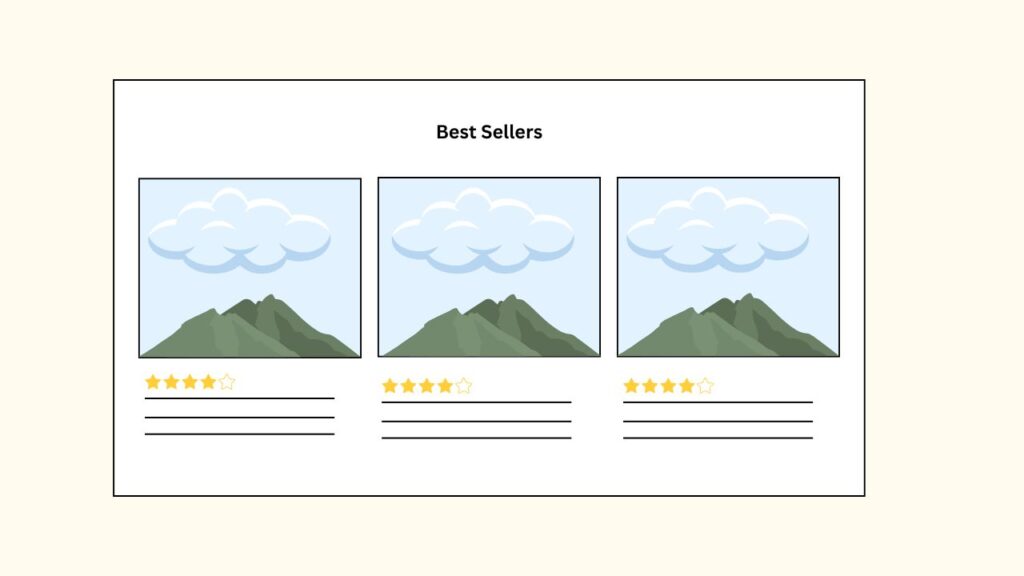
- Highlight Customer Favorites: Feature products that have proven to be popular among your customers. Displaying best-sellers builds confidence that others have purchased and loved these items.
- Add Value Tags: Consider including badges like “Top Seller” or “Customer Favorite” to provide additional nudges for potential buyers.
- Relevant Subheadlines: Provide subheadlines or captions that explain why the product is a best seller—whether it’s because of its quality, value, or popularity.
This section is designed to create urgency and drive customers to explore product pages, resulting in higher conversion rates.
4. Social Proof: Boost Trust with Testimonials
Testimonials and Reviews
Social proof plays a significant role in consumer purchasing decisions. A well-placed testimonials and reviews section will help build credibility, foster trust, and establish authenticity:
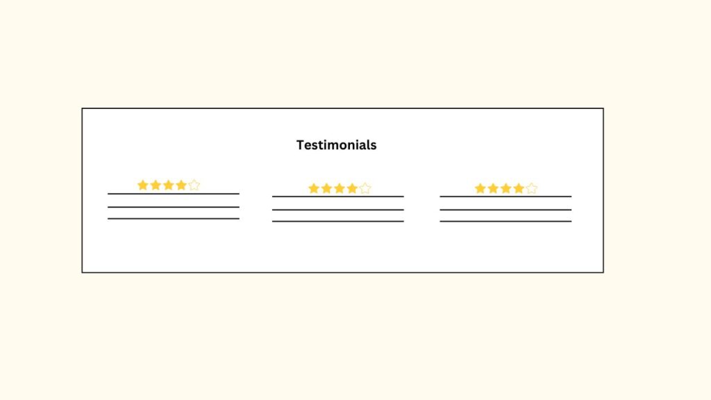
- Show Real Customer Experiences: Showcase customer testimonials that share specific outcomes or experiences. The more detailed and relatable these stories are, the more likely it is for new visitors to trust your brand.
- Include Specific Benefits: Focus on reviews that highlight how the product solved a problem or made life better. This helps new customers envision similar results for themselves.
- Visual Elements: Use customer images or star ratings to add a visual representation of the positive feedback. Make sure that the testimonials are highly relevant to the target market.
Social proof is essential for building trust, especially if your brand is new. Displaying testimonials prominently can have a powerful impact on buying decisions.
5. Collections: Organize Products into Categories
Product Categories and Collections
For an e-commerce store, it’s crucial to help shoppers navigate easily and find what they’re looking for quickly. A well-organized product categories and collections section can make this process smooth:
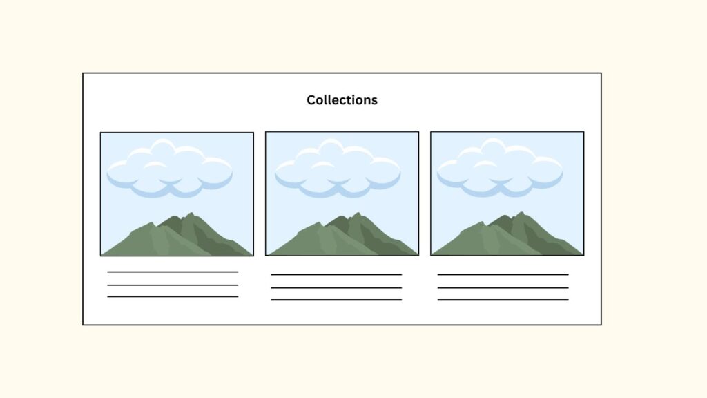
- Break Down into Collections: Group your products into easily digestible collections. These categories can include different styles, product types, occasions, or even best-sellers.
- Differentiate Product Types: Use images to distinguish different collections visually. This makes it easier for shoppers to understand what each collection represents.
- Guided Browsing: Clearly label and use appealing images for each collection so shoppers can quickly grasp their options and proceed to browse products that match their interests.
Organizing products into collections simplifies the customer journey, helping shoppers make quicker decisions and ultimately leading to better conversion rates.
6. Guarantee or Call to Action: Reduce Risk to Encourage Purchases
Risk Reversal and Action
Every potential buyer faces some level of risk or hesitation before making a purchase. Addressing these concerns directly can significantly increase conversions:
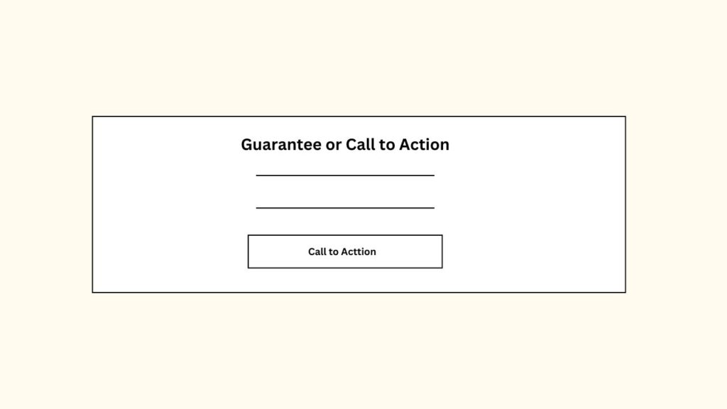
- Money-Back Guarantee: Offer a risk reversal tactic such as a money-back guarantee or a satisfaction guarantee. This encourages shoppers to take action by reducing perceived risks.
- Clear and Compelling Call to Action: Once customers are aware of the guarantee, invite them to make a purchase through a clear CTA. For example, a button reading “Try Risk-Free” can be a powerful nudge to help convert undecided shoppers.
- Highlight Value Propositions: In this section, also reiterate your core value proposition. Summarize what sets you apart and how you provide unmatched quality or service.
A well-crafted guarantee or call to action section reduces the buyer’s hesitation and helps close the sale by making customers feel more confident about their purchase decision.
7. The Power of Consistent Messaging and Design
Every section of your e-commerce homepage should align with your brand’s voice and aesthetic. Consistent design ensures a seamless experience for visitors, making navigation intuitive and the overall journey enjoyable.
Consistency Across Elements
- Color Scheme: Use a consistent color scheme across all sections. Colors can evoke certain emotions, and aligning these with your brand identity helps reinforce trust.
- Typography: The font style should be consistent, with headings, subheadings, and body text sizes clearly defined. Consistent typography makes reading easier and creates a sense of unity.
- Visual Hierarchy: Each section should follow a clear visual hierarchy that leads the viewer’s eye from one important piece of information to the next. For example, the headline should draw attention first, followed by subheadlines, images, and finally the CTA.
Responsive Design for All Devices
An effective homepage is optimized for both desktop and mobile users. Responsive design allows your homepage to adapt fluidly to different screen sizes, ensuring every visitor has an optimal experience regardless of their device:
- Mobile-Friendly Layouts: Design elements should rearrange to fit mobile screens naturally. For example, hero images should adapt to different dimensions, CTAs should remain easy to tap, and product sections should stack vertically for easy scrolling.
- Fast Loading Speeds: Ensure that images and videos are optimized to minimize loading times, particularly for mobile users. A fast-loading homepage contributes directly to higher conversions and better user retention.
8. Visual and Psychological Triggers to Boost Conversion
Your homepage can employ subtle design techniques to nudge customers towards conversion:
The Rule of Thirds
When designing your hero and product image sections, consider the rule of thirds. This design principle helps create a visually pleasing layout, ensuring that critical elements like CTA buttons are placed in prominent positions.
Color Psychology
- Blue for Trust: Blue is often associated with trust and reliability, which makes it an ideal color for guarantees and customer testimonials.
- Red for Urgency: Use red or similar contrasting colors for your CTA buttons to instill urgency and grab attention.
White Space for Focus
Don’t be afraid to use white space strategically. White space helps separate elements, making the homepage appear less cluttered, and it directs focus to critical areas like the headline, product benefits, or CTA buttons.
9. Measure, Analyze, and Optimize
The work doesn’t stop once your homepage is live. To ensure it’s continuously converting visitors effectively, you need to gather data and iterate accordingly:
Use Heatmaps to Understand Visitor Behavior
- Heatmaps are useful for understanding which areas of your homepage are getting the most interaction. You can identify which elements draw attention and which ones are ignored.
- Adjust CTA Placement: If visitors are clicking around certain areas but ignoring the CTA, consider relocating it to a more prominent position or increasing its size.
A/B Testing for Continuous Improvement
Conduct A/B testing for different headlines, images, or CTA buttons. Test one element at a time and gather sufficient data to understand which variations perform better in terms of conversion.
Track Metrics Regularly
Metrics such as bounce rate, conversion rate, and average session duration will help you understand how effective your homepage is at keeping visitors engaged and turning them into customers. Use analytics tools to make data-driven decisions for optimization.
Read About: 7 Free AI-Powered Tools to Boost Your Productivity in 2024.
Conclusion: Effective E-commerce Homepage
A well-optimized Effective e-commerce Homepage is an invaluable asset for any online store. By carefully designing each section—from the hero with a strong value proposition to the testimonials that build trust and the collections that guide customers—you can significantly improve user experience and conversions. Pay attention to consistent messaging, intuitive navigation, and elements that foster trust, and remember to use real data for ongoing optimization. The result will be a homepage that not only attracts but also converts and retains customers, turning casual browsers into loyal brand advocates.